Shippsy, a B2C innovator, transforms Canadian shopping with a streamlined solution for U.S. store purchases. Combining competitive pricing with enhanced transparency via an upgraded dashboard, Shippsy offers a seamless experience trusted by thousands of users everyday.
Role
UX/UI design, collaborate with steak eating office dogs.
Challenge
Redesign Shippsy dashboard, optimize mobile and desktop.
Time frame
6 weeks
Structure
User research, user centred design, collaboration, iteration & implementation support.
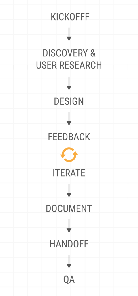
Discovery & user research highlights
Design Brief
All the known specs, links, references, copy docs, etc are all housed in the design brief, which all team members have access to.
Research
Competitive analysis is created. Site audit and information architecture is carried out to fully understand the variables we are working with.
Cross Collaboration
Every step requires collaboration. This allows us all team members to have their voices heard, to ensure we have aligned goals, and to manage expectations.
User Interviews
Internal user interviews are carried out to gather helpful insight that will shape design thinking and final outcomes.
Design Brief
The first is to create a design brief which will be the holder of all things important. This is templated in a trusted google sheet. Here any member of the team can find concise goals, links to research, personas, milestone dates, and assigned point of contacts. Point of contacts may be seem obvious, but depending on the feature, vacation days and specialties the point of contact may vary. In short, it’s a cheat sheet that helps us all stay aligned at all stages.
Goals
Milestone Dates
Persona
Point of contacts
User Interviews
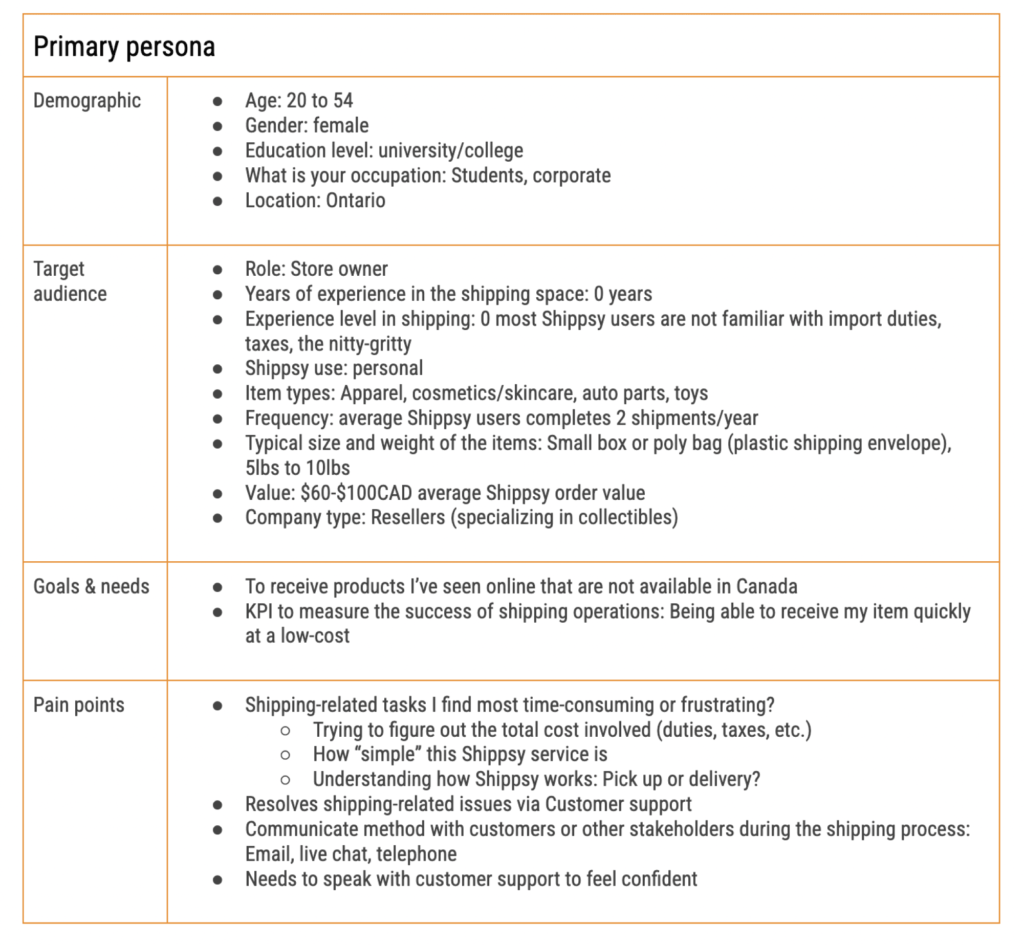
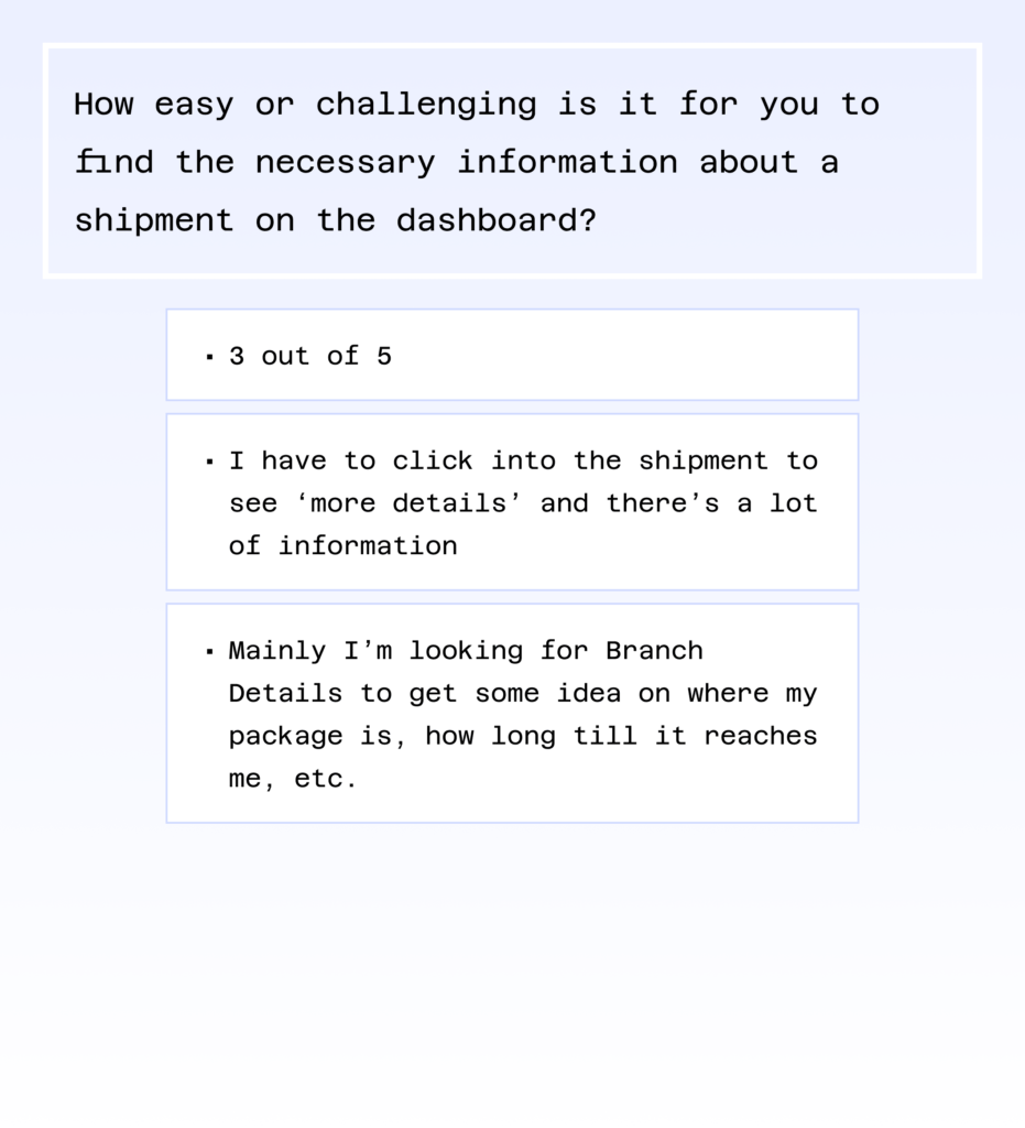
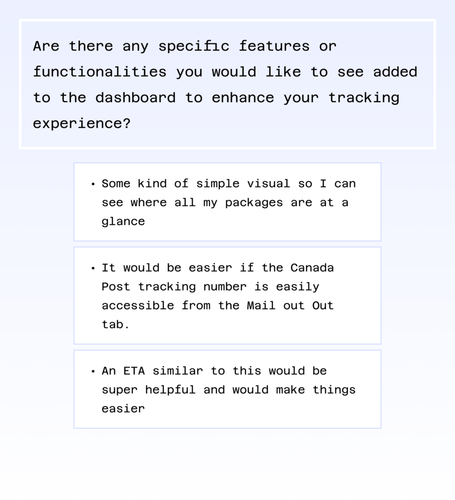
Internal user interviews were created and given to the Head of Marketing and the Shippsy’s customer service manager. The questions found here allow me to understand the user’s goals, frustrations, and to see which features they feel are working well. Think “if it aint broke, don’t fix it”. Usually researchers focus on the bad, but I leave room to target what our user’s feel is working well.
These insights allow me to develop user centred solutions and information based designs 📐✨.
Collaboration & Information architecture
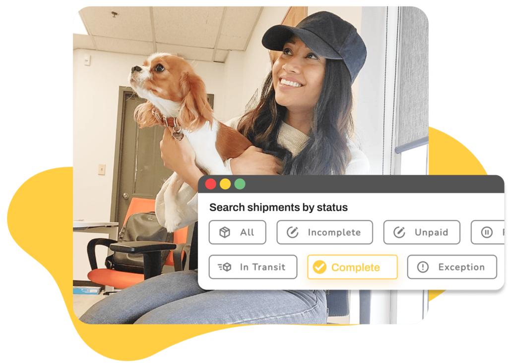
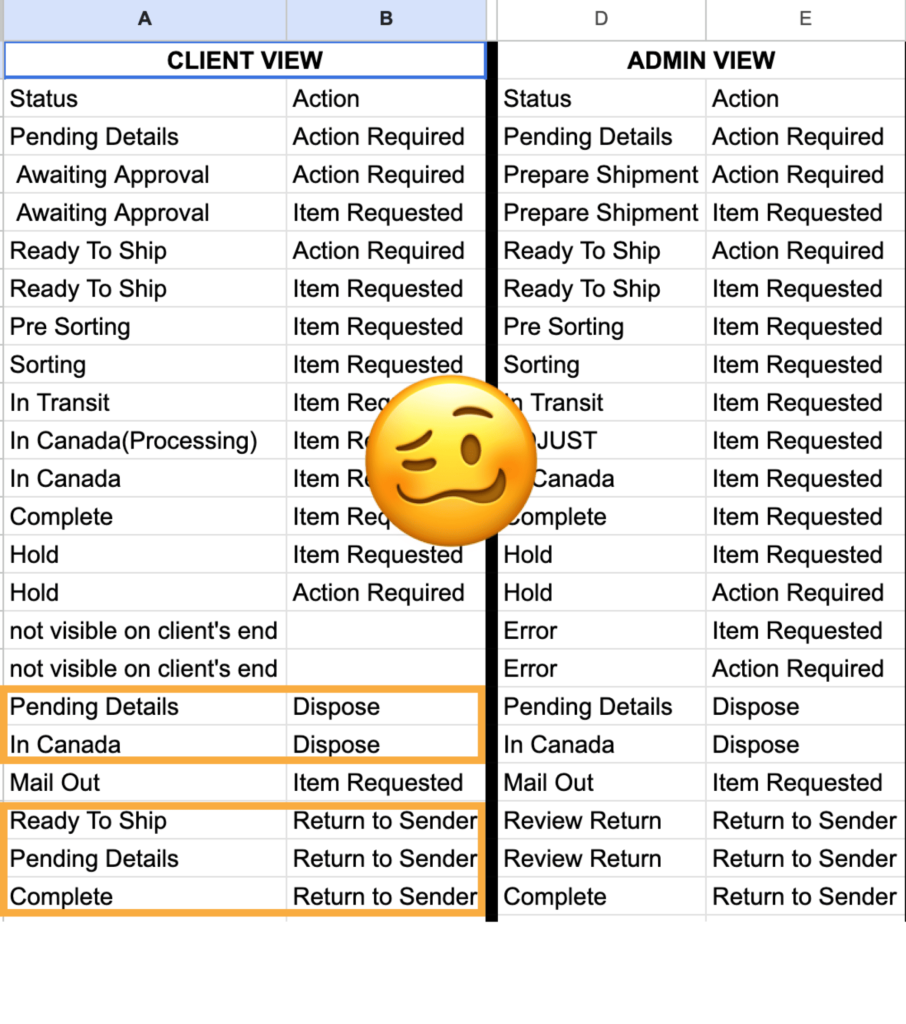
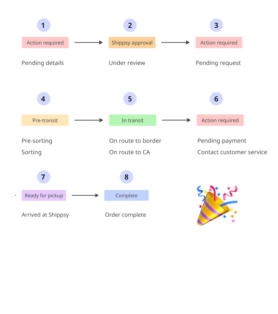
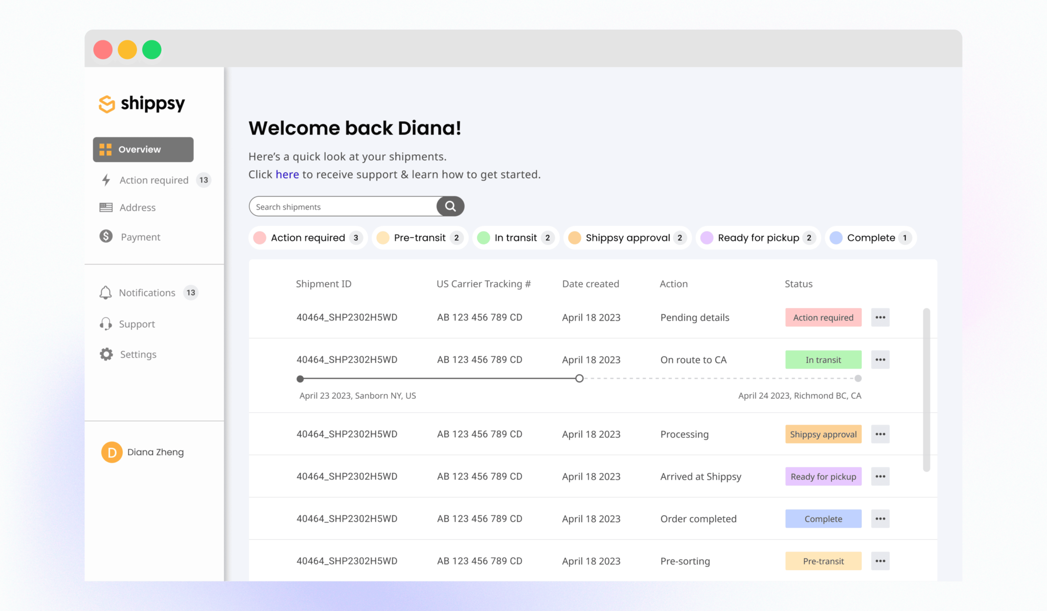
While waiting to hear back from my questionnaires, I do a site audit. I find the the purpose of each page & component and confirm my findings via a meeting with my product manager. From here it was clear that 55% of the number of pages could be reduced. With 6 of the pages being a category of a shipment status – it was obvious that all statuses could be housed in one central location.
Another huge finding, was that 15 of the current statuses was able to be trimmed to just 8, a 53% reduction. With the clutter reduced, the pages and statuses were collaboratively ranked to create an on point information architecture.
Dashboard inventory
Documenting opinions
Identifying legacy items
Information architecture
Design highlights
Moodboard
Moodboard options are created in order to fully understand the teams expectations regarding the look and feel of the dashboard.
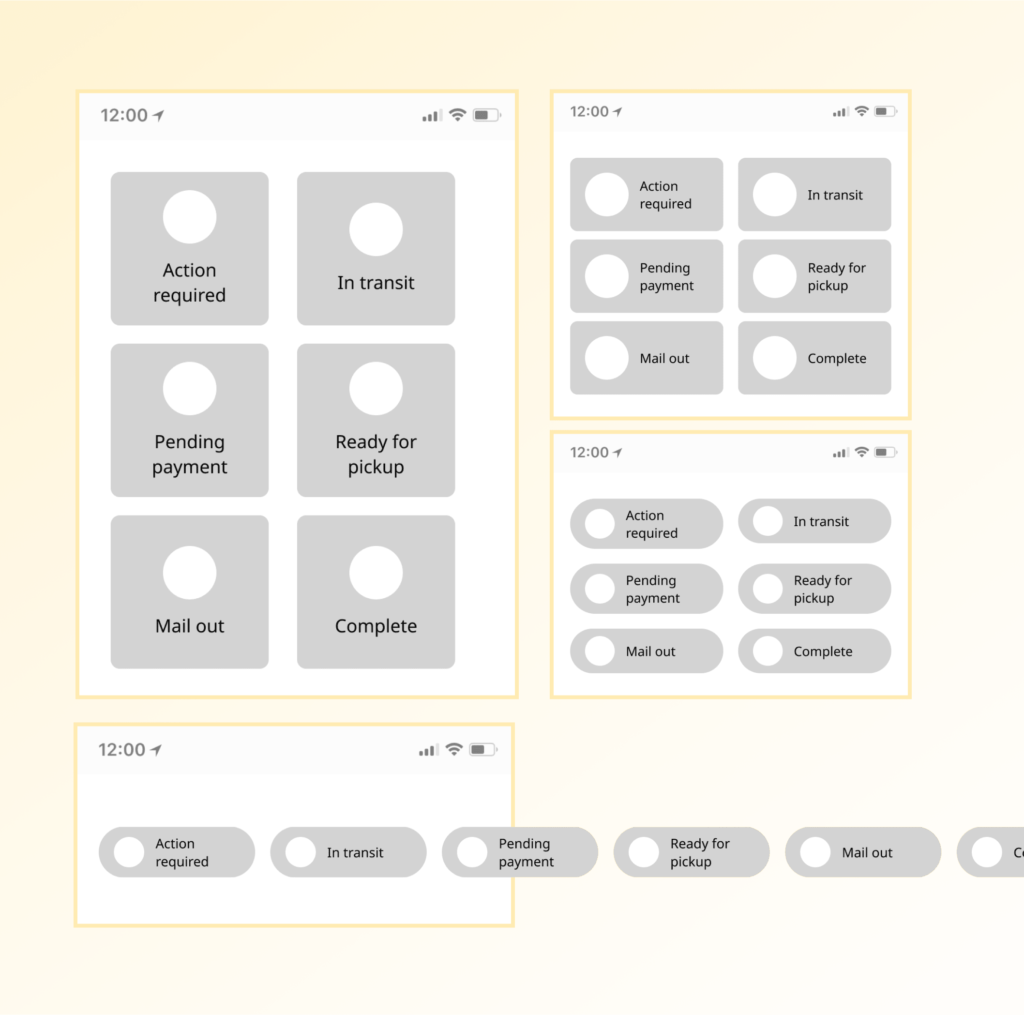
Midfi screens
The structure and information architecture play a big role in this stage. Once the team is aligned with the blueprint, the hifis begin to be developed.
Iterations based on
feedback
Feedback on the midifs are discussed and tracked in slack threads before it is applied. This helps team members stay on the same page.
Hifi screens
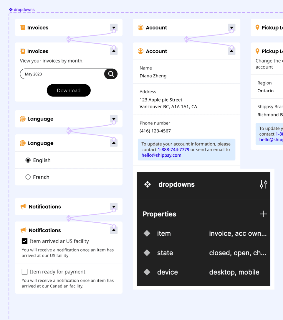
Fully accessible, responsive, and prototyped screens are created based on team collaboration, research, and user empathy.
Moodboard
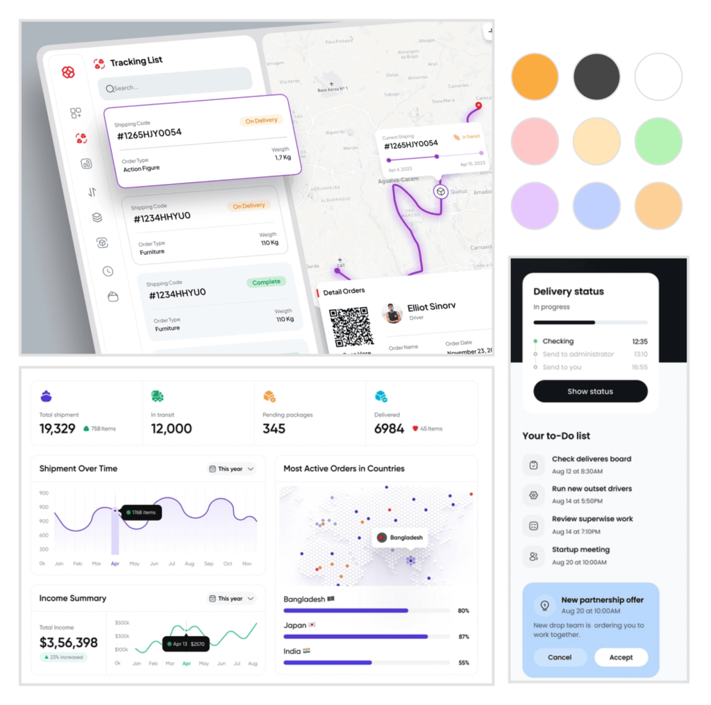
Once the research and information architecture have been completed, I create moodboards to capture the general look and feel the team wants the dashboard to embody. I presented 2 options, the first was dark and moody, showing dark backgrounds and neon colours for a sharp contrast. However, the team wanted a lighter and softer look, so they went with the second moodboard. The team really enjoyed the features such as: the progress bar for shipments on the way, the colourful status circles the the mobile card view.
Discussing the teams aesthetic expectations helped me to fully understand what direction to pursue.
Moodboard options
Colour palette
Favourite features
Collaboration
Midfis & iterations
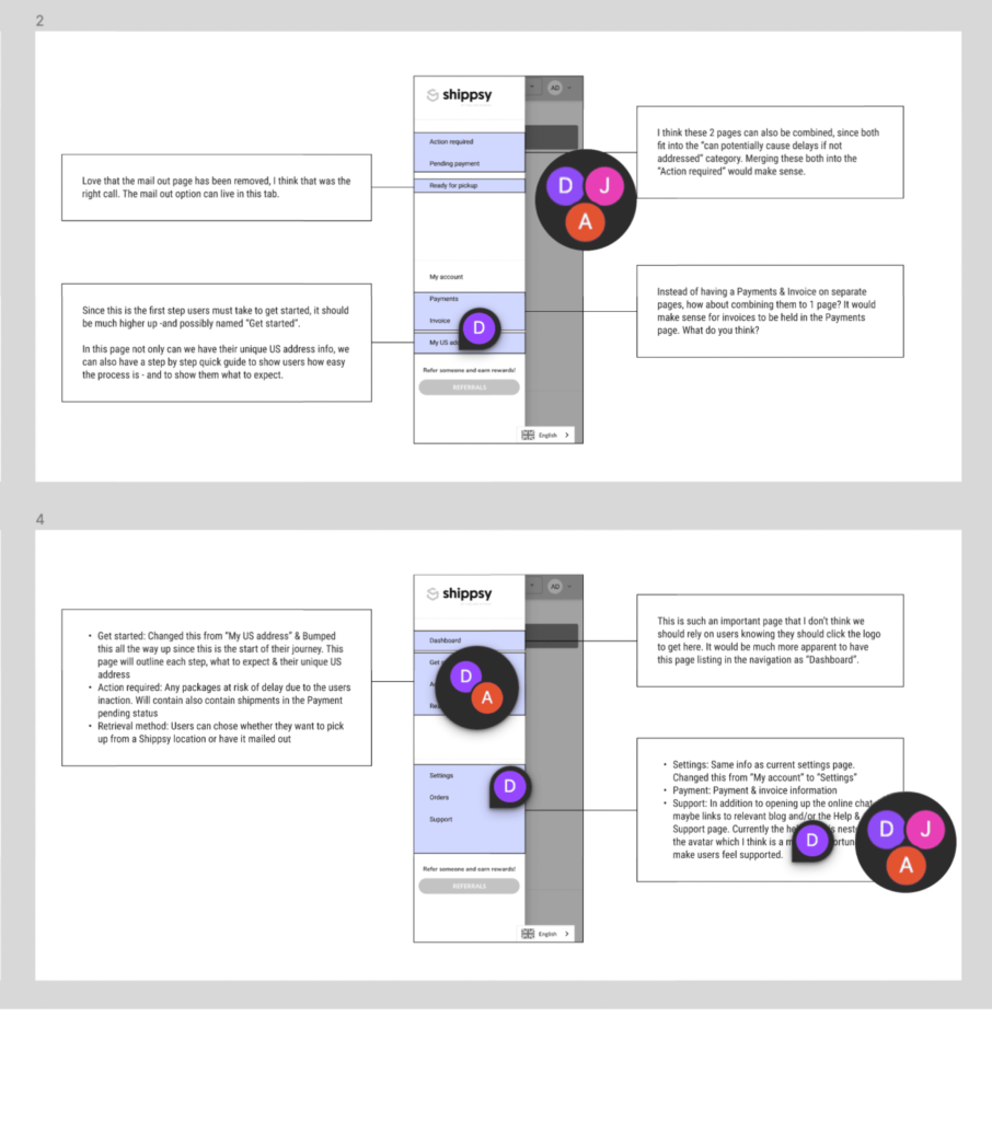
Now that I had all the theoretical structure, I was able to move on to sketching and midfi-ing. I sketched solutions, then midfi the solutions with the most potentional. The midfis get shared with the Head of Marketing/Product manager, Customer service manager, the Head of Technology and the CEO.
With all hands on deck I iterate based on feedback discussions derived from our slack channel. Why not from Figma or a formal meeting you ask? Well, this is so all team member can review and rebut each other’s concerns transparently, with all team members able to chime in. This helps shorten feedback loops and broken telephone, and truly make this collaborative.
Sketches
Transparency
Collaboration
No broken telephone
Hifis at last
After a few rounds of hifi revisions stemming from the navigation bar and the status filters, the team was very happy with the outcome. Consolidating the pages made the navigation less cluttered and the refined statuses made the shipments much easier to track.
Ranking of newly added features & themes:
Every single component in this redesign is compliant with accessibility guidelines. This is a huge accomplishment since the previous design had a lot of white text on yellow backgrounds. It was a challenge to have the team adapt to the removal of all yellow CTAs, but in the end I was able to achieve AA compliance while still maintaining soft and clean vibe.
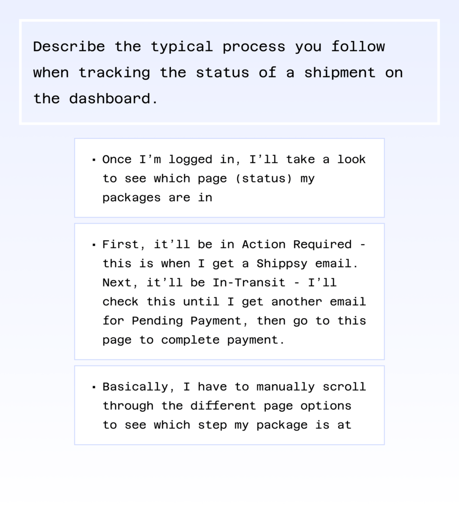
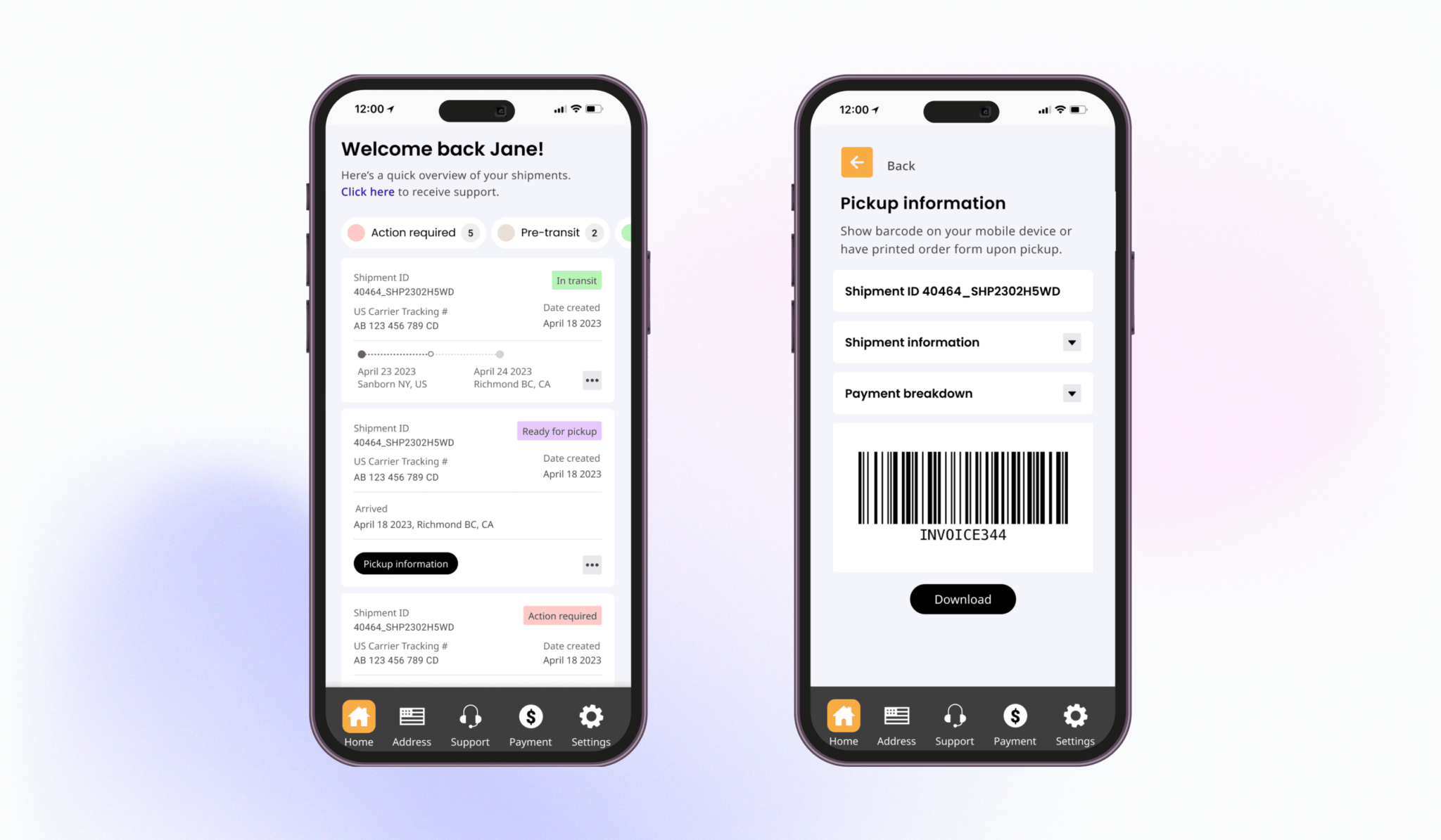
The “Action” column: this gives users further insight about where their shipment is in the process. For example, the status “Ready for pickup” confused our users – which resulted in users reaching out to customer service to find out what this meant. They weren’t sure if this meant the carrier still needed to pickup the item, or if the item was waiting to be picked up by the user. This was remedied with the “Action” column stating “Arrived at Shippsy”.
CTA located inside row/card: this allows users to take the next step with confidence and steamline their workflow. For example, when the item is ready to be picked up, the CTA that appears in that shipment row/card says “View pickup information”. This instantly opens up a new screen/modal that reveals the barcode needed to retrieve the shipment. Previously, when an item was ready to be picked up, users would have to go to separate page, locate their item on a chart, and then select the item to open up a modal. In all, this feature saved our users 4 clicks and drastically reduced user frustration.
Responsive designs
Fully accessible designs
Streamlined workflows
Improved user confidence
Reduced clutter
Handoff highlights
Edge cases
Just when you think you’re ready to pass the design baton off to the development team – is when the edge cases come out of the woodwork.
Handoff
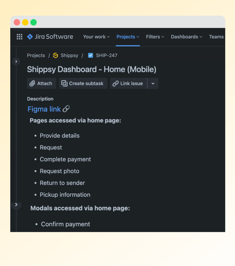
The handoff begins by walking the development team through the prototypes. Next, Jira tickets are created and assigned accordingly.
Design system
update
The design system system is updated to ensure consistency in execution and design thinking – as well as to help us scale both our product and team.
Quality assurance
To ensure designs are implemented accurately, I go through each page as it’s developed. Revisions are noted in Jira tickets via visuals aids and video as well as meetings & huddles.
Edge cases & handoff
The next step was to hand this off to the developers. Although they have been involved in all major steps this far, we still walked them through the final product to ensure nothing slipped through the cracks. It was at the stage where we learned something did in fact, fall through the cracks. It came to our attention that the page that had been removed, needed to be restored for our business clients.
This was missed because they are not our primary users, and take up less than 8% of our user base. We learned that they utilize this particular page a lot, in order to manage their large number of pending shipments. We decided to add this page, only for business clients, and keep it removed for our primary users.
Once this was all ironed out, I created the Jira tickets, which contained Figma links. They the Head of technology assigned the tickets away.
Design system update
Now that everything was fully handed off, I updated the design system with all the new components. Because of the iterative nature of this process, I went through all screens to ensure everything was consistent and contained the correct variations.
Maintaining the design system is a crucial step to ensure consistency and to save time when designing the next dashboard for Outgive’s main product, Stallion. Additionally, the design system allows us to scale not just in terms of product, but also in terms of team members. Once our design team grows, the design system will play a major role in bringing everyone up to speed and allow us to design confidently and autonomously.
Quality assurance
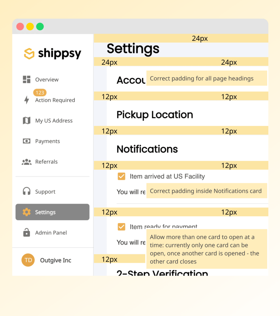
Once the designs slowly begin to be implemented my the development team, I get notified when certain pages are ready for review. When I find inconsistencies with implementation, I note them in the Jira ticket via a comment and if it’s a complex issue, I use visual aids such a screenshots with circles areas of concern or a short Loom screen recording.
If developers require additional clarification, I either set up a meeting or a request a quick huddle via slack. I bench whatever I am working on at the time, to ensure the dev team gets the support they need to ensure the integrity of the design are met. No matter how many rounds of revisions are needed.