Methodify is an automated market research platform that helps companies gain insights directly from consumers in as little time as 24 hours. This allows companies to make informed decisions very quickly.
Role
Lead UI designer, UX designer, Design dog meetup coordinator
Challenge
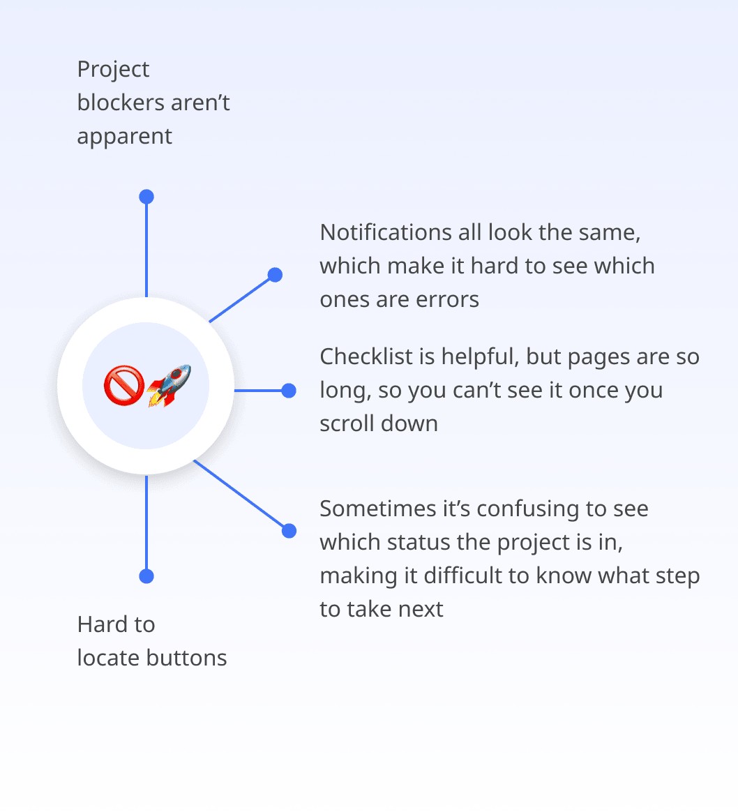
Users were frustrated that they were unable to quickly identify which survey error was preventing them from moving forward and ultimately launching their project.
Time frame
4 weeks
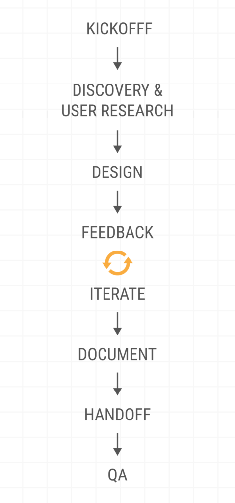
Structure
User research, user centred design, collaboration, iteration & implementation support.
Discovery & user research highlights
Kickoff
Product managers and the Product architect present features to the designers. All preliminary info & high level goals are housed in the design brief.
Research
Internal user interviews used to identify existing and potential issues. This allowed us to build efficient designs centred around user needs.
Cross Collaboration
Every step requires collaboration. This allows us all team members to have their voices heard, to ensure we have aligned goals, and to manage expectations.
Pain points
Pain points are concretely identified and passed on to our partners to show exactly what we are solving for. This ensure no effort in exploration is wasted.
Kickoff
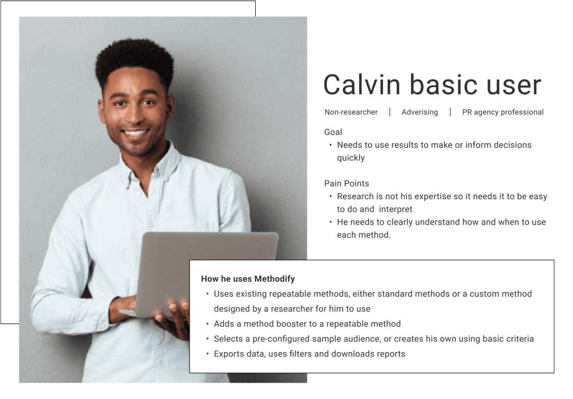
A kickoff meeting is held where our partner, a VP of product, presents what problem or feature we are working on and which persona we’re building for.
My partner explained that users are having a difficult time identifying which errors are preventing them from moving forward with the next step. We went over the design brief which is essentially a collaborative Word doc containing all feature information. At this point it only contained background information and a high level goal.
Feature introduction
User personas
High level goals
Next steps
Research & collaboration
After digesting the problem I arranged a design brainstorm with the design team where I outlined issues with the current experience and from there we bounced ideas off each other. From here I had outline pain points, which would later help me create potential solutions and hypothesis.
Unfortunately testing our hypothesis directly on our users is ironically not part of our process. Instead we run them by our partner, the VP of product and VP of product & platform since they have the most communication with the users as well as.
Pain points
This was the starting point. The yellow boxes indicate a collossal waste of space. The button(s) were hidden in the header due to low contrast. Important information such as the survey name, price and status were scattered all over the page.
Lastly, in instances where the user had selected their survey appear in 2 languages – the stimuli was always stacked on default no matter the screen size. Also, the language tags are a football field away, and this made me sad.
Accessibility requirements
Collaboration
Goal to maximize space
Information architecture
Design highlights
Moodboard
A moodboard was created to demonstrate to the rest of the team, the look and feel of the new components, and to help manage aesthetic expectations.
Midfi screens
The structure and information architecture play a big role in this stage. Once the team is aligned with the blueprint, the hifis begin to be developed.
Iterations based on
feedback
Feedback on the midifs are discussed and tracked in slack threads before it is applied. This helps team members stay on the same page.
Hifi screens
Fully accessible, responsive, and prototyped screens are created based on team collaboration, research, and user empathy.
Moodboard
The only new colours that were introduced were the notification colours. Currently the notification colours were all the same muddy brown – despite the urgency of the message. The colours were chosen to reflect the level of urgency:
fuscia: error messages that will prevent your survey from launching. Usually error messages are red, however I did not want this page flooded with red error messages, thus making this experience daunting
blue: informational messages such as tips. A calm blue was chosen since we are not in dire need for users to see this
yellow: payment message, this appears in instances where additional credits may be needed since a hard to reach sample group was selected
New brand colours
Colour psychology
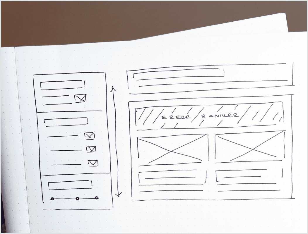
Sketches & midfis
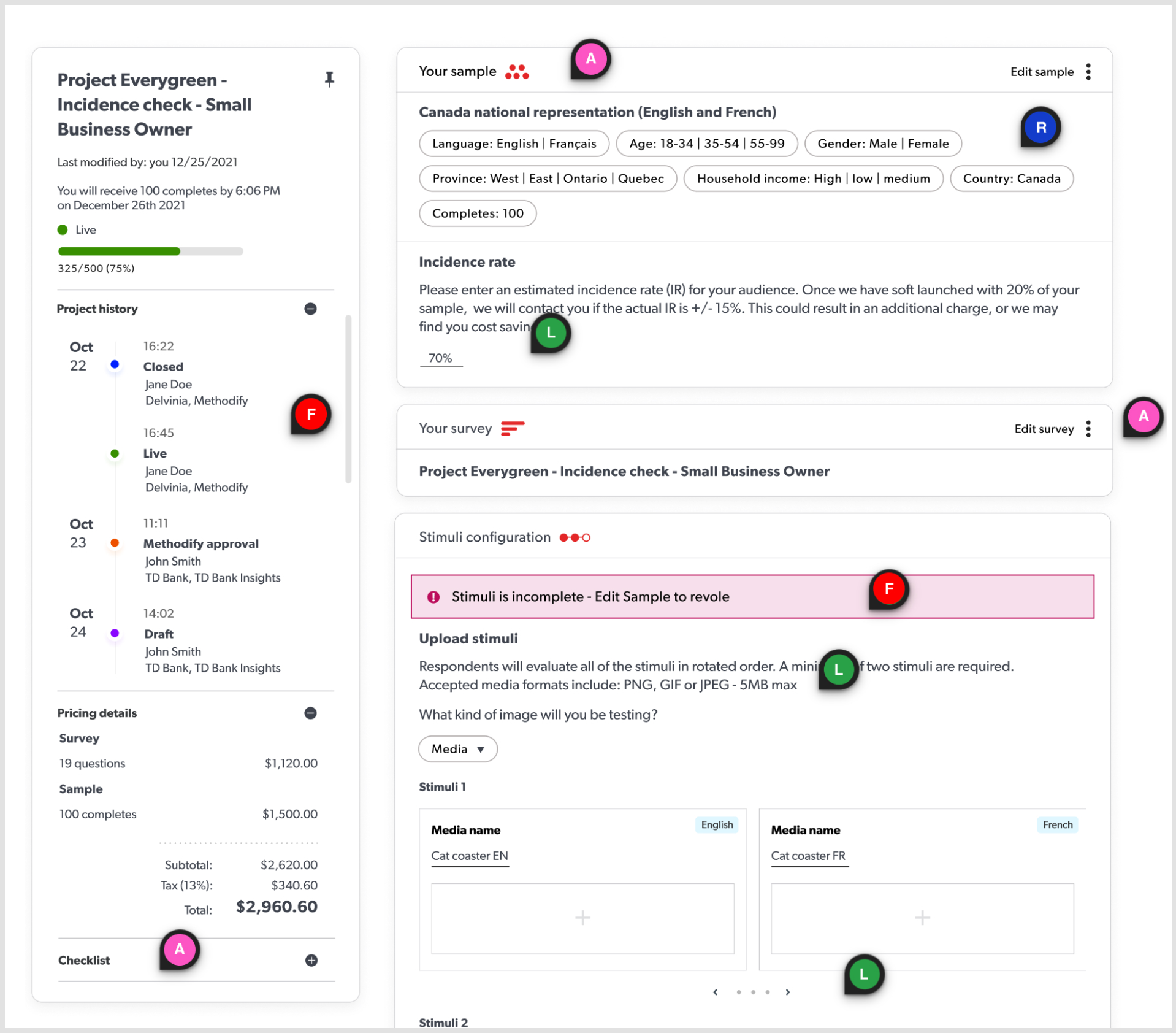
The current left panel was being under utilized, so I planned to pump this up and fill it with all project information. My vision was to have a one stop shop where all info can be easily accessed. I also wanted the info panel to move with the user so that it was within reach no matter how far down they scrolled and to have an independent scroll to maximum the space.
The most important functionality I wanted to add was to have users instantly taken to the problem card just by clicking the error message in the info panel.
I also planned to maximize all the negative space in the stimuli cards so it is more scannable. Chunkating information together allows users to focus in one area at a time and makes for calmer experience since the users can anticipate where information will be located. Bringing the same stimuli together (but in different languages) would allow users to quickly see which stimuli needed to be fixed and would appear more manageable.
Sketches
Midifs
Plan of attack
Chunkating info
Feedback & iterations
I constantly share my work with the design team outside of scheduled meetings by either streaming on Discord, sending prototype links or even screenshots on Teams to get their feedback.
In one of our meetups a UX designer pointed out that the information hierarchy should be adjusted to align with the most important project information. So we switched the order and put the pricing section above the project history section.
At the end of the sprint we share our final prototypes with the whole team and we review each other’s to ensure nothing fell between the cracks. We refer to this period as approval week. In this phase we learned we had been acquired by Schlesinger Group, which meant the colours had to be tweaked. Goodbye to bright orange icons and hello to green, blues and many aquisition/welcome meetings.
Collaboration
Pivoting
Prototypes
Approval week
Hifis at last
After a few rounds of functionality iterations, the prototypes were ready to be handed off to the development team.
Ranking of newly added features & themes:
Accessible buttons: improved contrast which is AAA compliant, is much more easy to locate and use now that users can actually see it. These buttons prompt users to take the next step so it was very important all users can access them.
Compliant messages: all messages now meet accessibility guidelines and have meaningful colours to help differentiate their level of importance.
Stimuli card size & location: stimuli cards are now responsible and utilize space. Additionally, having stimuli cards with the same language appear directly to the left/right, when viewing on desktop, makes it much easier for users to ensure that copy and media are consistence. Also, it drastically reduces vertical space!
Project history links: in addition to displaying project history, users can now simply click their colleagues name to send them a quick email. This is helpful for large companies, where not all people who touch the project work together. For example, marketers, steak holders, and members of the product and design team may all have a vested interest in the outcome of the survey – but they don’t necessarily work together. So instead of looking them up on Slack and then confirming it’s the right person, users can simple send them a quick email.
Fully accessible designs
Responsive designs
Streamlined workflows
Improved user confidence
Reduced clutter
Handoff highlights
Handoff
The handoff begins by linking user problem statements to our prototypes, then presenting them to the dev team. Next, Jira tickets are created and assigned accordingly.
Design system
update
The design system system is updated to ensure consistency in execution and design thinking – as well as to help us scale both our product and team.
Quality assurance
To ensure designs are implemented accurately, I go through each page as it’s developed. Revisions are noted in Jira tickets via visuals aids and video as well as meetings & huddles.
Handoff
Our features are presented to the dev team by the VP of product and platform. I answer any questions about design decisions and take note of any areas of concern or misses edge cases. Once everything is worked out I update Sweet potato with any new components, variants and nested documentation.
Handoff is not when I say goodbye to my designs, it’s more of a see you later because the dev team regularly reaches out, and I review their work before it goes live. Once deployed I check for bugs. And then these designs usually make a casual appearance in my dreams.
Design system update
I updated the design system along the way, but now that everything was fully handed off I did another check to ensure all icons, new components and colours were documented.
Additionally I added the teams design thinking to major components, so team members and future team members can utilize and contribute to Sweet potato with this in mind.
Quality assurance
Once the designs slowly begin to be implemented my the development team, I get notified when certain pages are ready for review. When I find inconsistencies with implementation, I note them in the Jira ticket via a comment and if it’s a complex issue, I use visual aids such a screenshots with circles areas of concern.
If developers require additional clarification, I either set up a meeting or a request a quick huddle via slack. I bench whatever I am working on at the time, to ensure the dev team gets the support they need to ensure the integrity of the design are met. No matter how many rounds of revisions are needed.