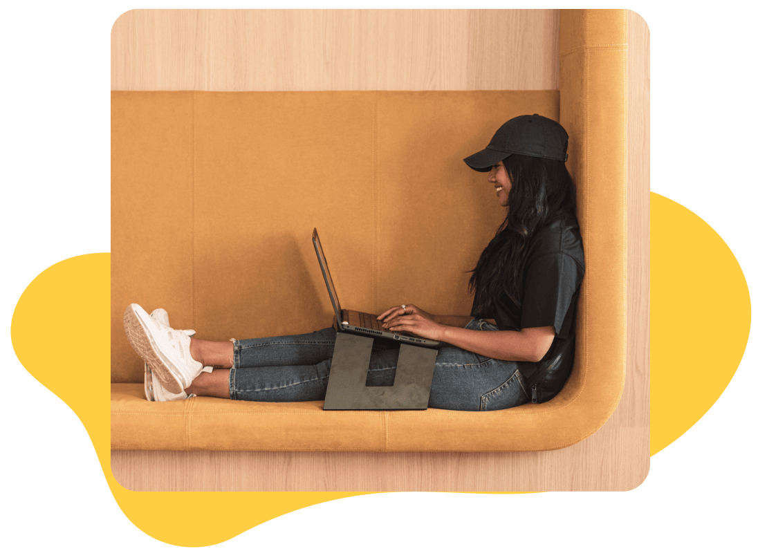
Horizn Studio specializes in the gamification of learning modules for financial institutions. As a UX/UI designer, I create learning modules that keep employees and customers up to date. A few of our clients include: RBC, HSBC, Scotia Bank, BMO and CIBC.
Role
UX/UI Designs
Challenge
Module redesign to meet accessibly requirements, space to include more additional guidance and to make Horizn’s UI distinct from client’s UI.
Time frame
2 weeks
Structure
User research, user centred design, collaboration, iteration & implementation support.
Design highlights
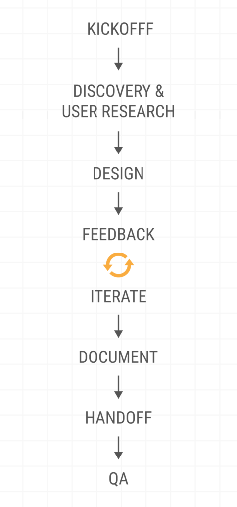
Kickoff
The Creative director explains to the design team, all the pain points our users are experiencing. He then highlights the main features we must implement.
Accessibility
Our dated learning modules did not pass accessibility criteria found in WCAG. We were required to implement new designs that could be enjoyed by all users.
Additional guidance
More context and guidance was needed, espcially for one of our main clients, HSBC HK. The current design did not allow for much needed copy.
Distinctive UI
Horizn modules overlapped with our client’s UI, making it difficult for users to differentiate which features were part of the module/clickable.
Kickoff
User pain points are relayed to Project Managers, then are passed on to the Creative Director, who then brief the design team.
It was brought to our attention that there were multiple accessibilty issues, no room for additional copy and that users were confused between Horizn and the clients UI.
Brainstorm
A few days after our kickoff meeting, once we’ve had time to process independently, the creative team comes together to brainstorm ways to elevate our product. We give each other feedback on our sketches/lofis, then render the crowd favourites.
Accessibility
With a new emphasis on accessibility globally, our current design has become outdated and has come under increased scrutiny.
Accessibility requirements are not addressed out of the box and quite a few updates have been requested by different clients in order to be acceptable from an accessibility standpoint.
Additional guidance
More real estate to explain the “Why” within demos. Coaching Tips are displayed beside each screen. However HSBC requests more space, overwhelming the design.
“Time to complete” is deemed useful. Should this be included in our solution and eventually used across all our content?
Distinctive UI
Some user feedback that we hear quite frequently is that Horizn’s UI is confused with the client’s UI within the demo. The CTA, help icon and page buttons are not as prominent as they should be.
Selected features
I’m proud to say that all features, minus the progress bar, was selected for development. The progress bar, although aesthetically pleasing, was obstructed from by the phone, making it suboptimal.